hmap for StataFollowing from this discussion Austin Nichols worked up
hmap for Stata, and now you can get it by
ssc install hmap
to produce something more like the Gnuplot output described below.
I use gnuplot and Stata to generate a heatmap
representation of a square matrix containing a measure of closeness
between 26 departments in a university. gnuplot is a
general-purpose plotting program, and can be wheedled into doing a lot
of things, but Stata's graphics routines are also very general. Given
data in i, j, n format (in blocks, that is with a blank line inserted
before every change of value of i), gnuplot can generate a
heatmap with code like the following:
set view map
set palette rgbformulae 21,22,23
set colorbox
unset border
set size square
set ytics ("LCS" 26, "LAW" 25, "SOC" 24, "PPA" 23, "HIS" 22, "ACF" 21,  MMA" 20, "PER" 19, "ECO" 18,  PHI" 17, "PSY" 16, "NMI" 15, "PES" 14, "EPS" 13, "LSC" 12, "MST" 11, "ARC" 10, "CSI"  9, "ECE"  8, "MOE"  7, "PHY"  6, "MAE"  5, "CES"  4, "MAS"  3, "ART"  2, "PLE"  1) nomirror
set xtics ("LCS"  1, "LAW"  2, "SOC"  3, "PPA"  4, "HIS"  5, "ACF"  6,  MMA"  7, "PER"  8, "ECO"  9,  PHI" 10, "PSY" 11, "NMI" 12, "PES" 13, "EPS" 14, "LSC" 15, "MST" 16, "ARC" 17, "CSI" 18, "ECE" 19, "MOE" 20, "PHY" 21, "MAE" 22, "CES" 23, "MAS" 24, "ART" 25, "PLE" 26) rotate nomirror

set object rectangle from screen 0,0 to screen 1,1 behind fc rgbcolor "beige"

set cbrange [0:15000]
splot [-1:27][-1:27]  "heatmap.dat" u 2:(27-$1):3 with image t ""
The result looks approximately like this: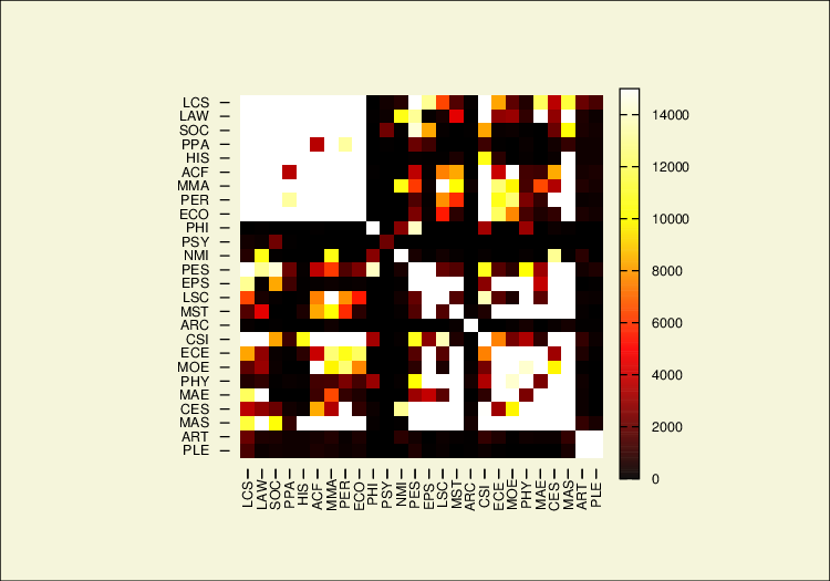
The palette is multi-hued, and this can be defined in a quite
general manner (set palette rgbformulae .... allows one
to set the red/green/blue levels across the value range by formulas,
including user-written ones).
In some ways it would be preferable to use Stata to generate the
heatmap, since that is where I do the data manipulation. Adrian
Mander's plotmatrix add-on provides most of the necessary
functionality. We need to put the information into a matrix first, and
it helps to be able to define the cut-points between different
colours:
tab row col, matcell(t)
matrix rownames t = LCS LAW SOC PPA HIS ACF MMA PER ECO PHI PSY NMI PES EPS LSC MST ARC CSI ECE MOE PHY MAE CES MAS ART PLE
matrix colnames t = LCS LAW SOC PPA HIS ACF MMA PER ECO PHI PSY NMI PES EPS LSC MST ARC CSI ECE MOE PHY MAE CES MAS ART PLE
plotmatrix, mat(t) split(0 2000 4000 6000 8000 10000 12000 14000 9999999) color(emidblue) aspect(1)
The resulting graph looks like this:
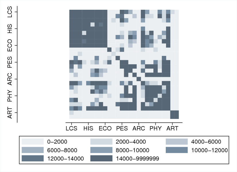
Apart from being monochrome and not having space for all the labels, the result is functionally equivalent. If you have any thoughts on either of these issues, I'd appreciate an e-mail.