Scary mutant COVID-19
Since the news of a potentially more transmissible strain of C19 broke in the UK, I’ve been thinking about the mechanics.
I was initially sceptical because it seemed to help politicians evade blame. Given the earlier fuss about a strain spread by holidaymakers returning from Spain in the summer, how much of the emergence of a new strain was down to network effects (common because it was, for example, present in a number of super-spreader events) versus inherent infectiousness?
So I simulated, with a workbench of 160000 agents in a 2D grid network, 1600 seed infections, and daily contact between 23 of the nearest 24 neighbours, and one random remote case. Base infectiousness, death and recovery rates are set to yield an R0 of about 3 and a SIR plot as in Figure 1.
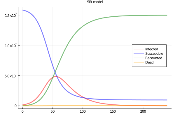
Figure 1: SIR plots
Variation in infections when no difference in infectiousness
How much variation in infection is there across strains? Let’s start by assuming each seed is a different strain, but with exactly the same infectiousness. We can expect there will be wide variation, particularly because some lineages will die out early, and small differences in early success may persist. Over the whole run of the simulation, if we track back the lineage of each infection to the originating seed and count, we get a histogram (Figure 2)
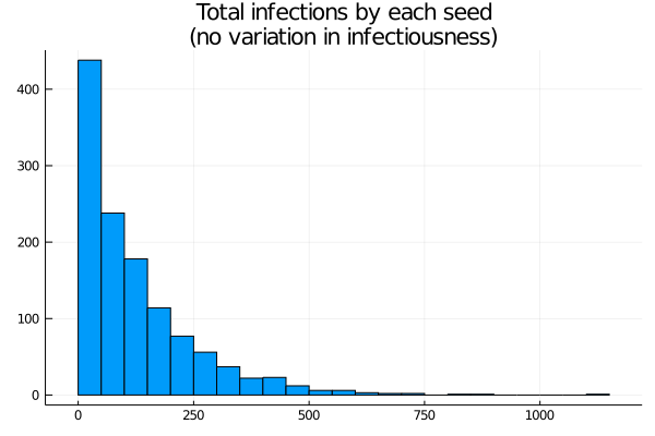
Figure 2: Histogram of cases by lineage
The distribution is highly skewed. Around 500 seeds cause zero or near zero infections. With the epidemic stabilising at a little less than 100% infection, the mean is a little less than 100 infections per seed, but there are significant numbers above 250, and peaks close to 1000. In other words, while each seed has the same infectiousness, the randomness of the infection process yields a really wide range of “achieved” infections. On the other hand, the most “successful” seed here accounts for less than 1% of the cases.
As an alternative to a histogram, here’s a Lorenz curve (cumulative number infected, by seeds sorted from fewest to most cases). If every seed had the same number of cases this would be a straight line (Figure 3).
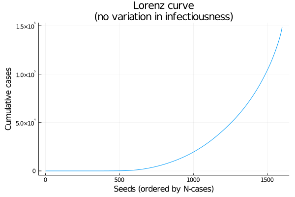
Figure 3: Lorenz curve: cumulative coverage of lineages, from least to most successful
What if infectiousness differs?
That leads us to the second question: what happens to this distribution if we allow variability in infectiousness? The simulation allows a variable spread of the probability of transmission per encounter, (keeping the mean more or less unchanged at time 0) as in this graphic, with nine levels starting at no spread, and going up to a standard deviation of about 0.004 (around an initial P(trans) of 0.0062545). Note that higher spreads are more likely to yield a max value well above the main cluster (Figure 4).
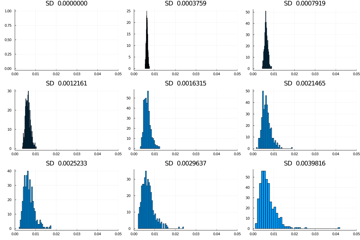
Figure 4: Spreads in infectiousness, nine models
Figure 5 shows nine Lorenz curves. To a first approximation the curves move monotonically down and to the right (i.e., towards greater inequality) as the spread increases. In fact, for the higher levels, the curves finish practically vertical.
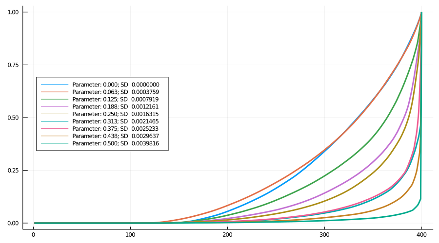
Figure 5: Lorenz curves: Nine models
As 6 shows, for spreads 6, 8 and 9, more than 50% of cases come from the most successful variant (for spread 7, by chance the highest infectivity is low relative to 6 and 8, evident in Figure 2). For spread 9, the most infectious lineage accounts for almost 90% of cases.
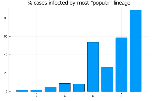
Figure 6: Nine models: Proportion of cases accounted for by the largest lineage
Conclusion
While there will be large variation between lineages even where there is no variation in infectiousness, adding spread to infectiousness dramatically increases the skew. This is largely driven by the extreme values, so it would be worth adapting this exercise to model the effect of a single more infectious variant (with differing increase in infectiousness) rather than simply skewing the distribution.
One more thing is apparent, though: as a more infectious variant spreads, the average infectiousness increases and the epidemic gets faster, as Figure 7 shows.
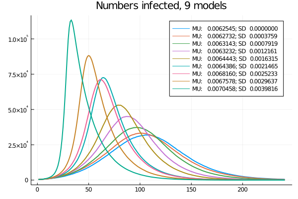
Figure 7: Nine models: Time-series of current infections
Code
The simulation is coded in Julia. sirdsen.jl is the main file, strain.jl has extra functions for this particular problem, and strainblog.jl creates the graphs for this blog. sirdsen.jl can do a lot of other stuff but it’s rough and ready code.
In the context of the emergence of a new strain, what role did network effects play, and how much of it was attributed to inherent infectiousness? Can you elaborate on the factors that contributed to politicians potentially evading blame in this situation? Were there specific super-spreader events or other network connections that played a significant role in the spread of the new strain?