Category Archives: Graphics

The shortest day and the earliest sunset

Everyone knows that Midwinter’s Day, the day of the Winter Solstice, is the shortest day of the year. I think about this a lot, mostly every December/March/June/September (also around DST time changes). A few years ago I discovered the R “suncalc” package. It’s full of interesting astronomical functions, and can show the timing of sunrise, sunset, solar noon and a whole lot of other things, for any date and location. So I’ve been playing with it to help me understand what’s going on.

library(suncalc)
library(ggplot2)
data = getSunlightTimes(date = as.Date(seq(0,32), origin="2023-12-08"), lat=52.7, lon=-8.6)
data$daylength = data$sunset - data$sunrise
ggplot() + geom_point(data=data, aes(x=as.Date(sunrise), y=daylength))

daylength.png

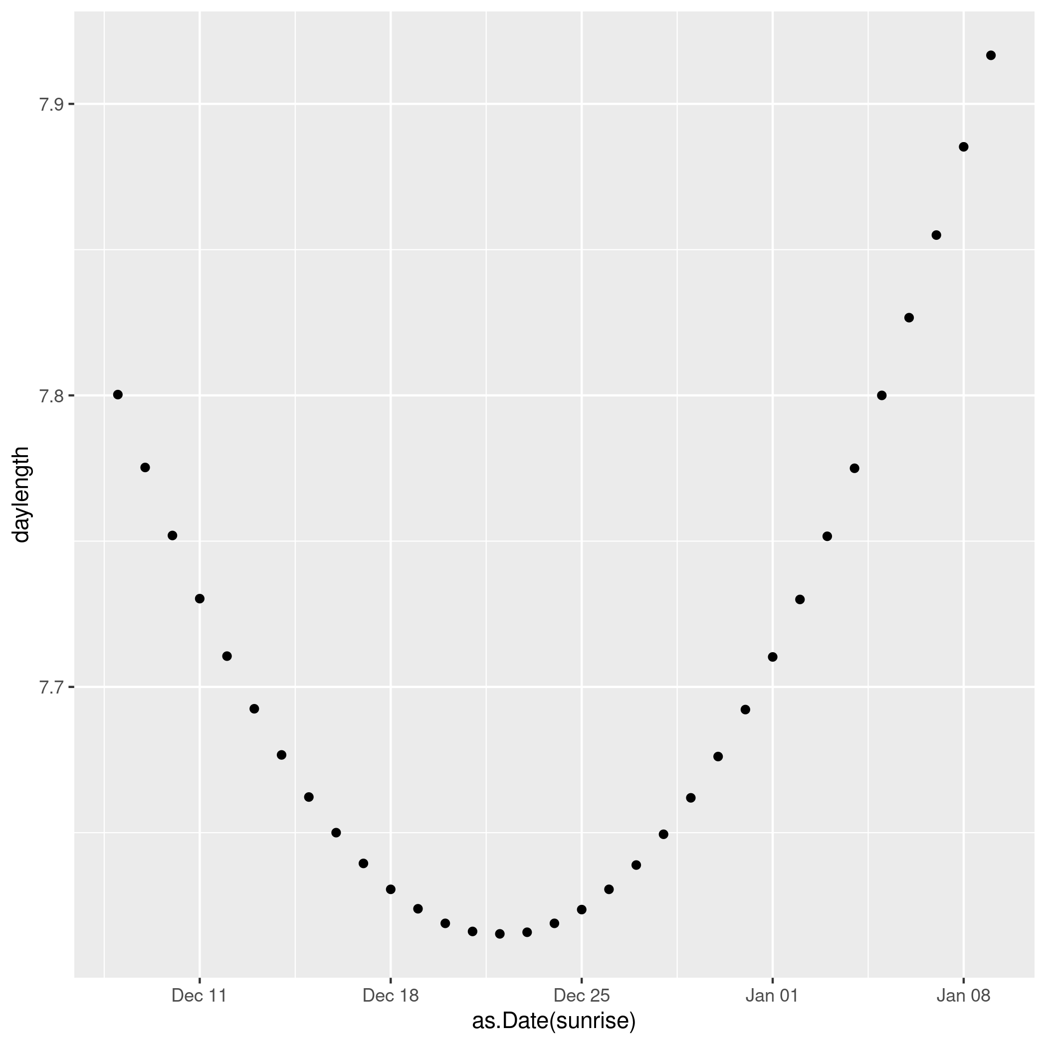
We see clearly that the shortest day in 2023 was Dec 22 (the exact solstice moment was 22 Dec, 03:27).

But the earliest sunset doesn’t actually happen then. It actually happened a few days earlier, Dec 15.

Continue reading The shortest day and the earliest sunset

Three-way referendums: Condorcet vs Instant Runoff

Simulating 3-way choice

I’ve been thinking about a potential second Brexit referendum, where a three-option menu is given:

  • 1: Exit the EU with no deal
  • 2: Accept the negotiated deal
  • 3: Remain in the EU

Three-way choices are alien to British experience of referendums, but don’t really pose great difficulties. First Past The Post (FPTP) is clearly undesirable, but instant runoff (IRV) and Condorcet voting are easy to implement and explain to the electorate. So I built a little simulation to help me understand the problem, particularly to look at the relative performance of IRV and Condorcet.

My conclusions in brief: Condorcet is much more likely to go for the compromise solution (the deal), IRV less so and FPTP the least. Condorcet also seems to correspond well with the average of the underlying utilities. When the population is skewed pro-leave or pro-remain, IRV and Condorcet give more similar results (because it becomes more of a two-horse race). Condorcet cycles are rare. Finally, FPTP is crap.

Continue reading Three-way referendums: Condorcet vs Instant Runoff

Comparative perspective on migration from Eurostat population data

Migration is a big issue at the moment in Europe, not least in the UK
where public fears about migration (stoked by a racist press and a Home
Secretary and now PM who, let’s say, seems to have a visceral unreasoned
belief that the presence of foreigners in some way harms Britain) lie
behind the Brexit vote.

There are other reasons for being interested in migration, of course.
For instance, I’ve been wondering a bit about gender differentials in the age profile
of migration and re-migration. So I started looking for data, initially
on the Irish CSO site, where I found annual year-of-age
population estimates.

Continue reading Comparative perspective on migration from Eurostat population data

Mapping with Python and Stata

Elevation data for large swathes of the planet have been collected by NASA and are available to download from http://dds.cr.usgs.gov/srtm/.

The data is contained in binary files, each representing a 1-degree by 1-degree “square”. Here are five lines of Python and four lines of Stata that will turn the data into a simple graph:

import struct
file = open("data/N52W011.hgt", "r")
for y in range(1201):
for x in range(1201):
print y, x, struct.unpack(">h",file.read(2))[0]

Do python file.py > map.dat. Then run this Stata code:

infile i j height using /tmp/ext.dat
gen h2 = int(sqrt(height))
replace h2 = 30 if h2<=0
hmap j i h2, nosc

Low res version of map

(Hi-res version.)

You may need to install Python’s struct package, and Stata’s hmap add on, but they’re available from the usual locations.

There are better ways of doing this, of course: it’s slow, the aspect ratio is wrong, the colours are not ideal and the axis labelling is bad. Even worse, it is a complete abuse of the hmap add-on. It’s a quick and dirty way to turn binary data into pictures, all the same.

Tips for Stata console mode

There are really three main ways of interacting with Stata:

  • In batch mode
  • Console mode
  • Through the GUI

Batch mode is critical to reproducible, self-documenting code. Even if you don’t use it, its existence is a reflection of the idea of a single do-file that takes you from data to results in a single movement. Most people use Stata through the GUI, most of the time, though, even when their goal is a pristine goal-oriented do-file. Stata’s GUI is clean, efficient and pleasant to use.

Console mode, on the other hand, is like the dark ages: a text mode interface (reminiscent of the bad old days before Windows 3.1, of DOS and mainframes). Why would anyone use it? Continue reading Tips for Stata console mode

Heatmaps in gnuplot and Stata

I use gnuplot and Stata to generate a heatmap representation of a square matrix containing a measure of closeness between 26 departments in a university. gnuplot is a general-purpose plotting program, and can be wheedled into doing a lot of things, but Stata’s graphics routines are also very general. Given data in i, j, n format (in blocks, that is with a blank line inserted before every change of value of i), gnuplot can generate a heatmap with code like the following:

Continue reading Heatmaps in gnuplot and Stata