Migration is a big issue at the moment in Europe, not least in the UK
where public fears about migration (stoked by a racist press and a Home
Secretary and now PM who, let’s say, seems to have a visceral unreasoned
belief that the presence of foreigners in some way harms Britain) lie
behind the Brexit vote.
There are other reasons for being interested in migration, of course.
For instance, I’ve been wondering a bit about gender differentials in the age profile
of migration and re-migration. So I started looking for data, initially
on the Irish CSO site, where I found annual year-of-age
population estimates.
I coupled this with figures on deaths from the Human Mortality Database, to calculate cohort-wise net
migration figures, defined as change in cohort size net of deaths, using
1996 as the base year. With this I generated, inter alia, the following
graph, comparing the timeseries of net migration for males and females
broken down by cohort. This clearly shows a very strong effect whereby
while both sexes are most likely to migrate in their 20s, males are much
more likely to re-migrate whereas females settle down (this
interpretation depends on the assumption that a lot of the post-crisis
decline in cumulative net migration was due to recent immigrants
re-migrating).
Once started on this exercise, I decided to widen my horizons, and went
to the Eurostat Population Database where both population and death data
is available by calendar year and year of age. This allows me to
calculate cohort net size between 1993 and 2015 for most European
countries, using estimates supplied to Eurostat by the national
statistical agencies.
This graphic shows this quantity (i.e., cumulative net migration) for a selection of EU countries, by
sex, expressed as a proportion of the population size).
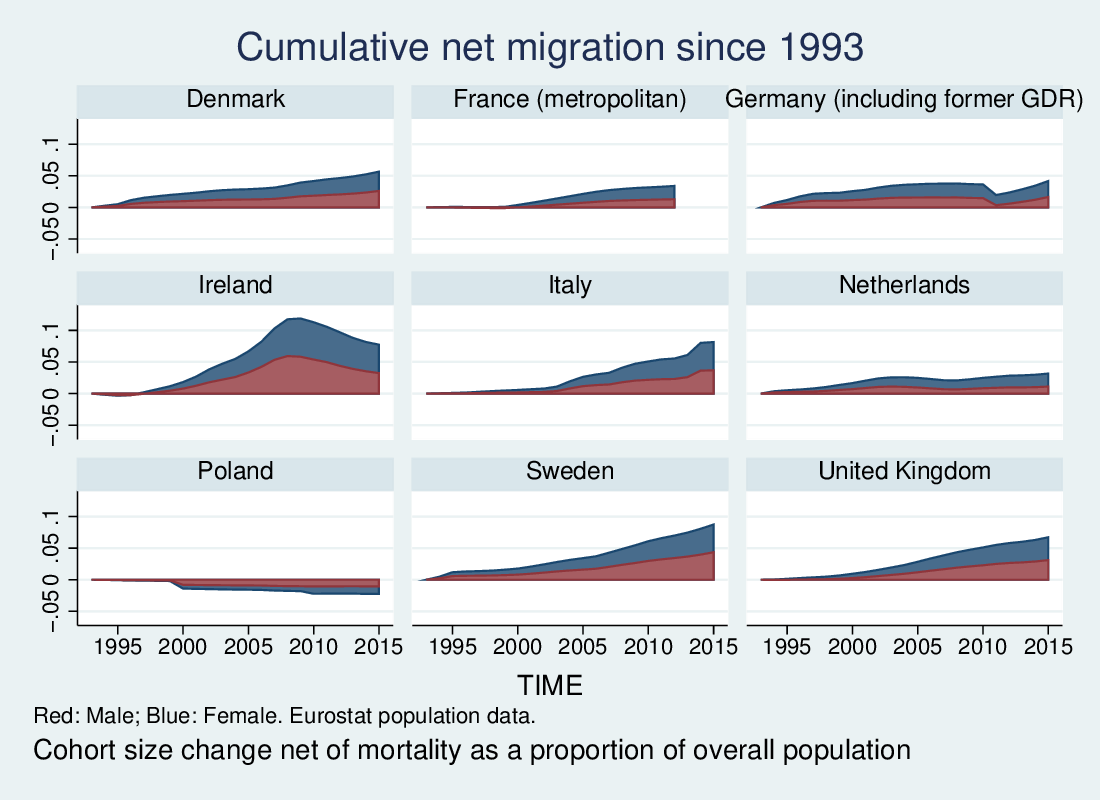
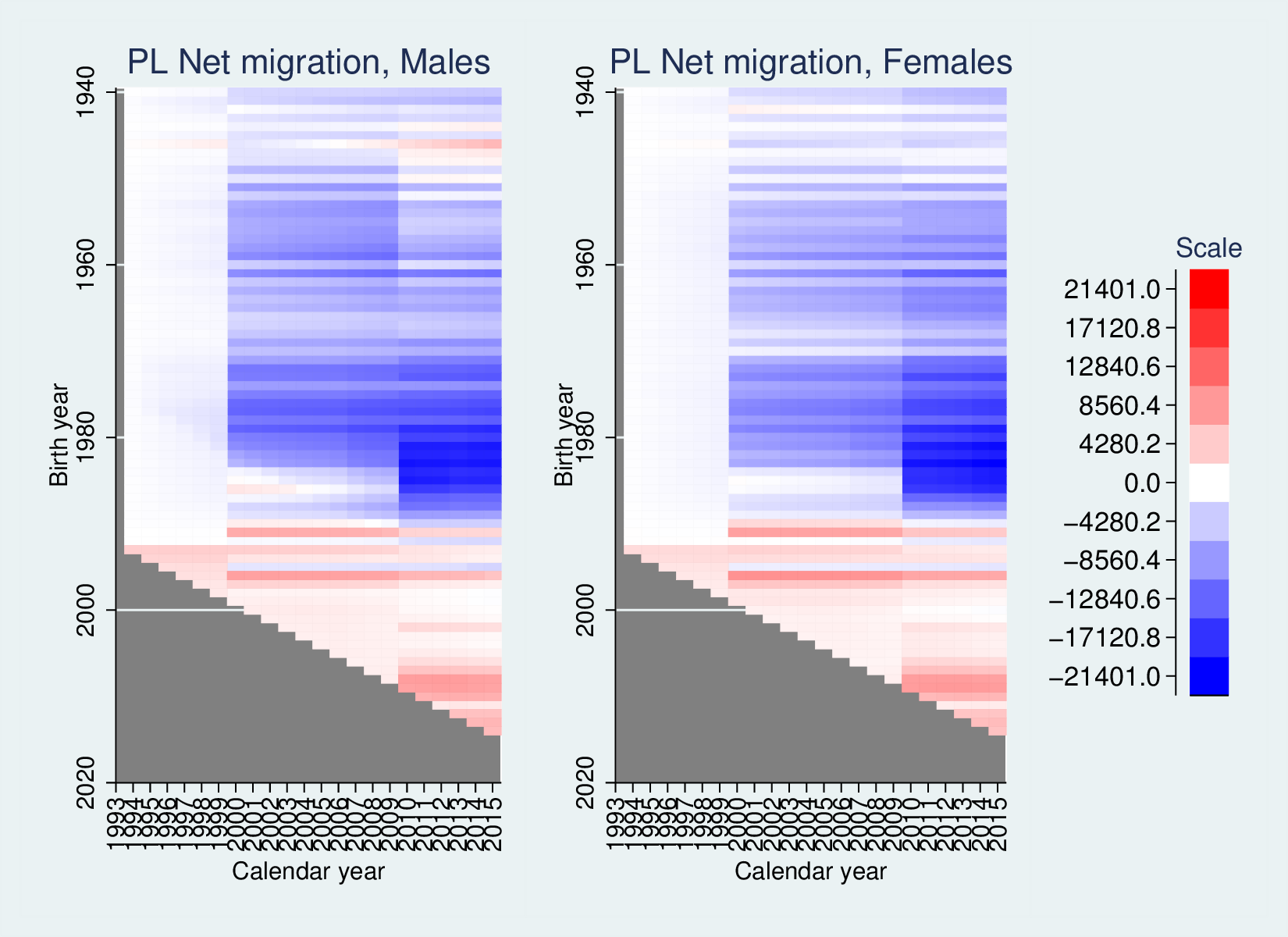
We see a number of different experiences here: Poland’s net emigration,
Ireland’s huge intake reversing after the financial crisis hits, and
otherwise different levels if net in-migration. Notably, while the UK
shows significant in-migration, it is hardly the most extreme, with
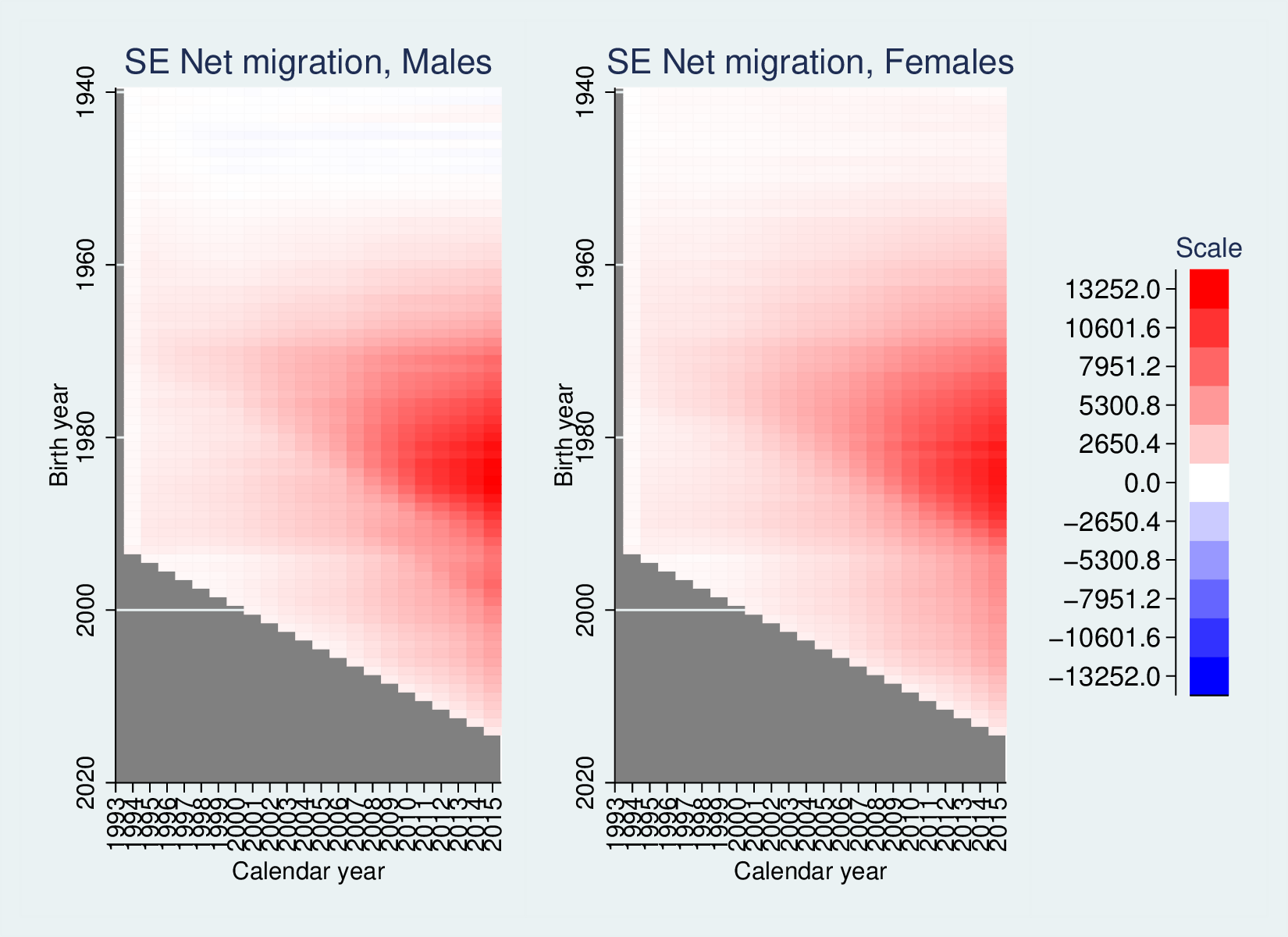
Ireland, Sweden and Italy showing higher levels.
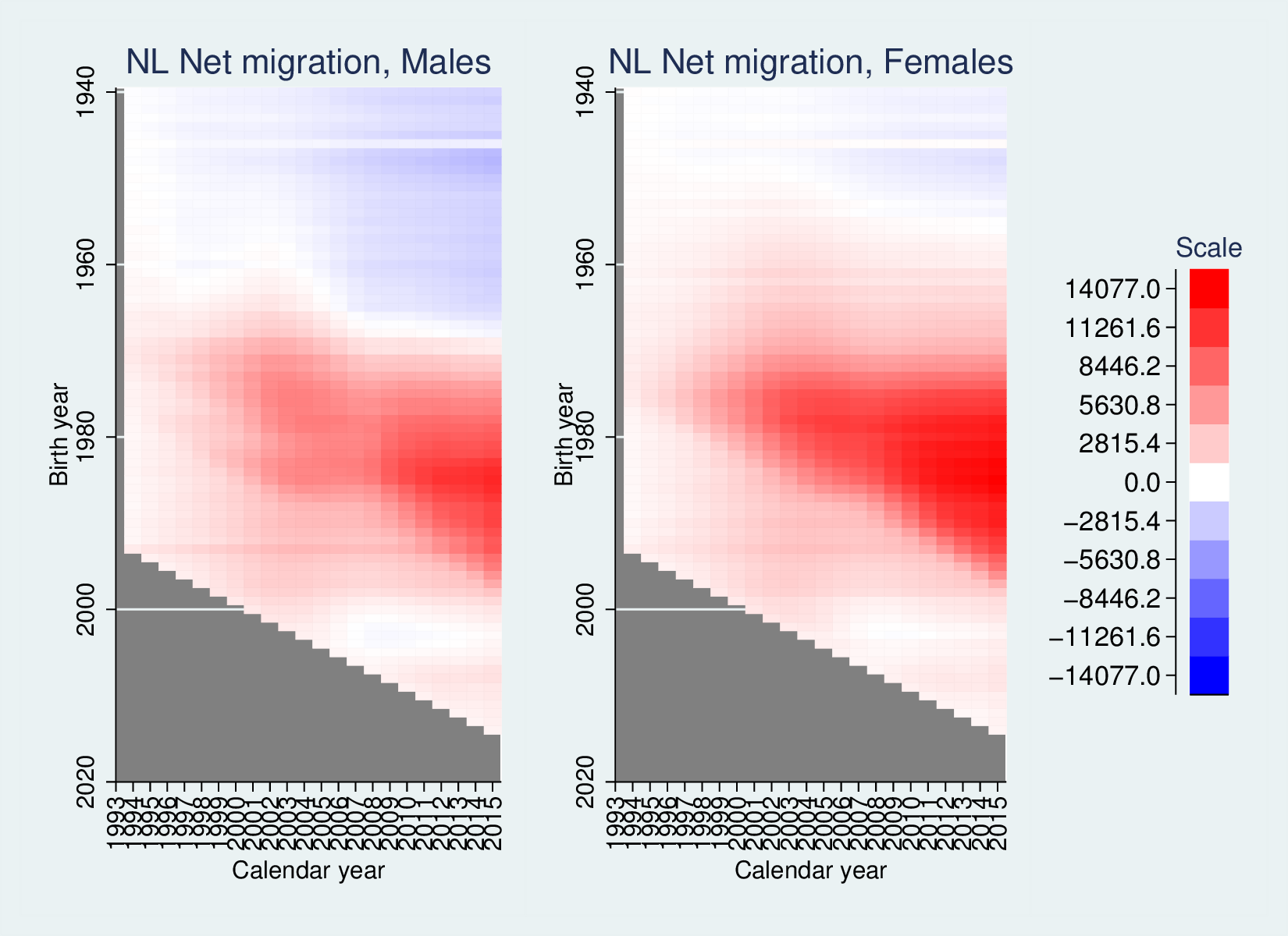
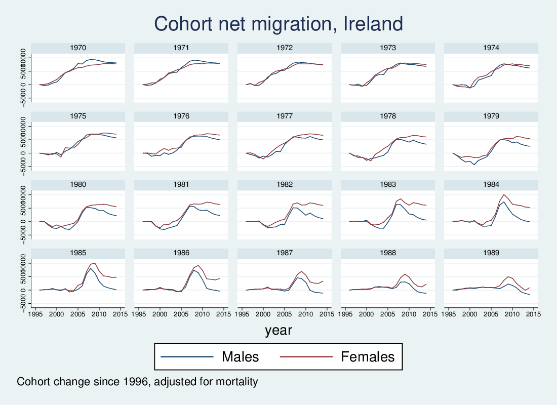
These are summaries, and important ones. But it is also possible to use
graphics to present more detailed data, using heatmaps to produce what
@jonminton calls “Lexis surfaces“. First, we can look at the data for
Ireland, looking at cohort-wise net migration by calendar year.
(If you want more info on how to create heatmaps in Stata, give me a shout.)
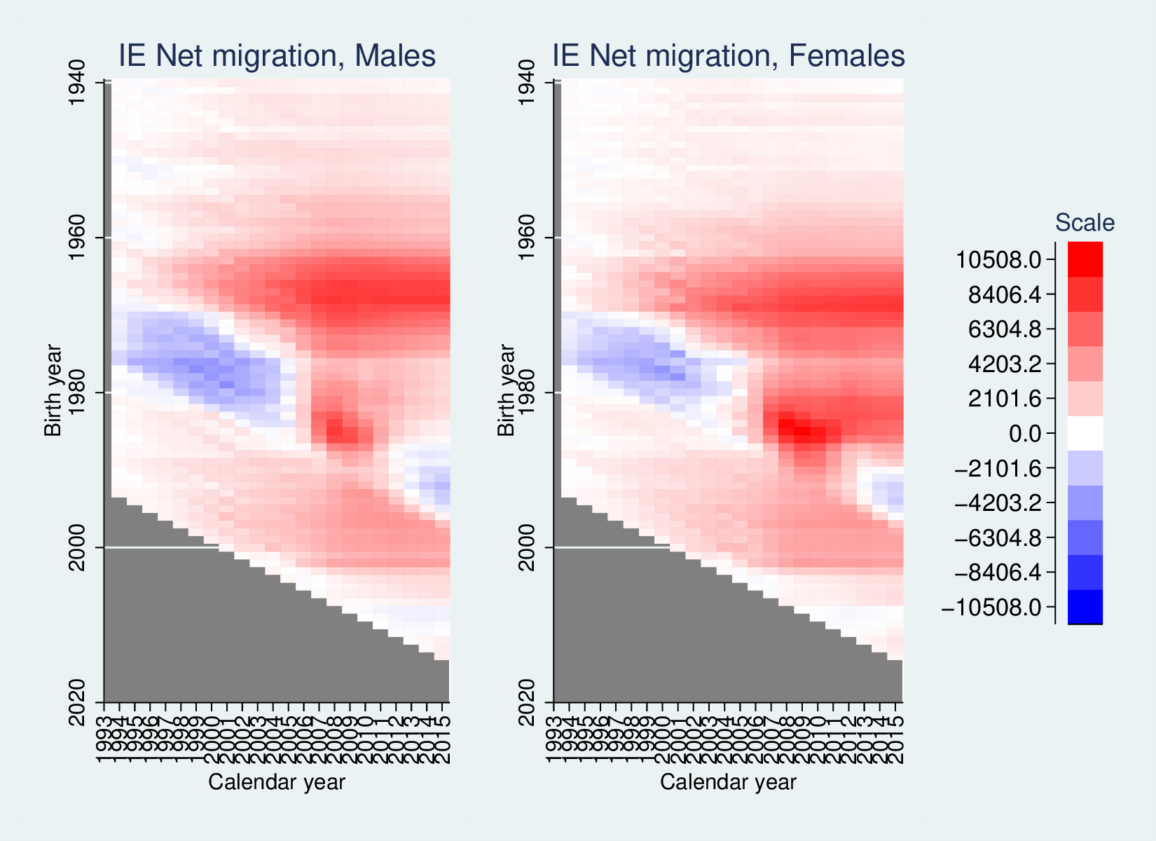
Since this is oriented in terms of birth-year, cohorts can be followed
horizontally, while age groups are represented by lines going down to
the right.
There is a lot going on here: First, apart from 2006-2012, there has
been serious net emigration for both males and females aged between
about 18 and 28. Despite the Celtic Tiger in the mid 1990s, people were
still leaving, but just before the crisis hit this was reversed. It also
took a while after the crisis for this age-group to go back net
negative. Otherwise we see really significant immigration of cohorts
born in the 1960s and 1970s from relatively early in the period,
sustained until the crisis and importantly showing little decline after
the crisis. A lot of these will be Irish people who emigrated earlier
returning as the economy picks up.
On the whole the male and female pictures are similar, except for the
feature picked up in the first graphic: females are less likely to
re-migrate – that is, particularly looking at the 1980s cohorts, there
is markedly less post-crisis drop-off than in the male data.
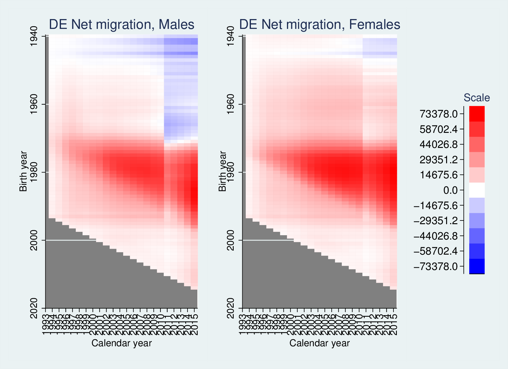
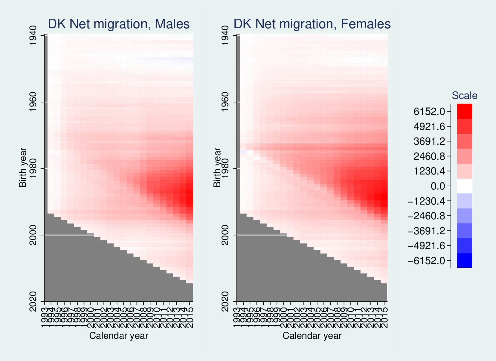
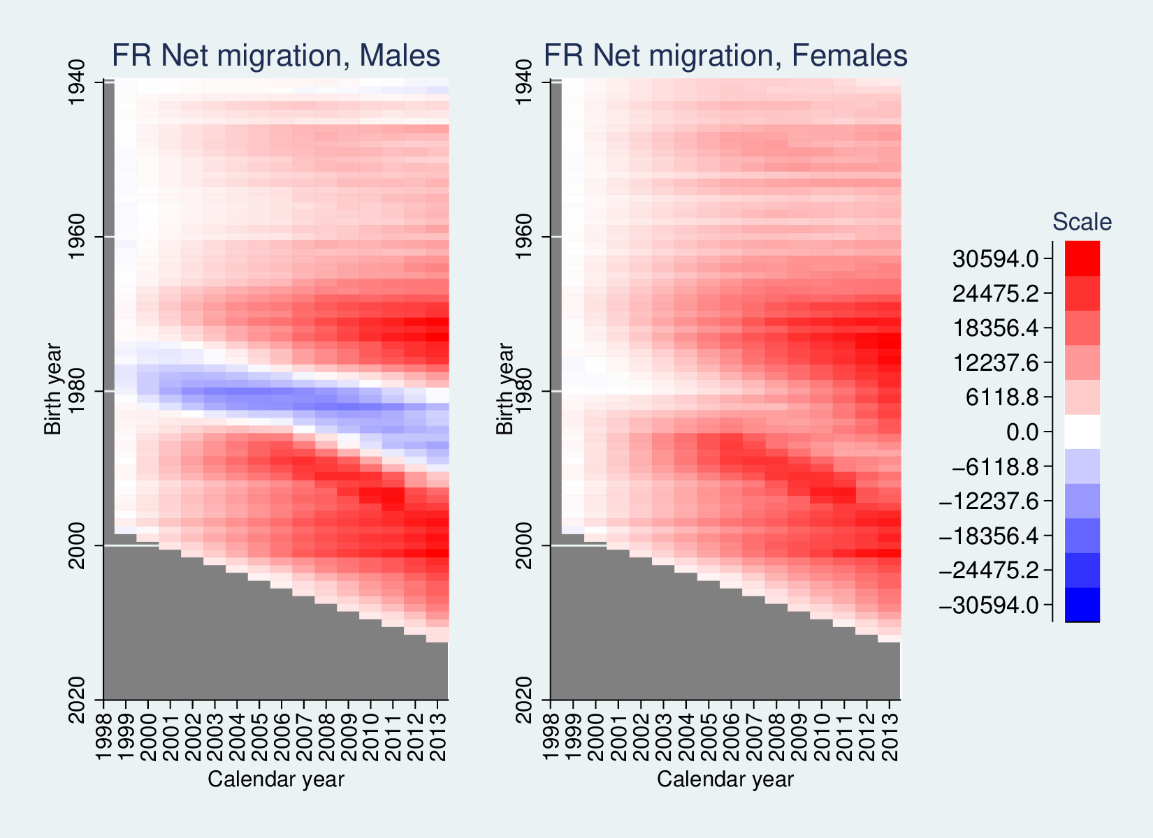
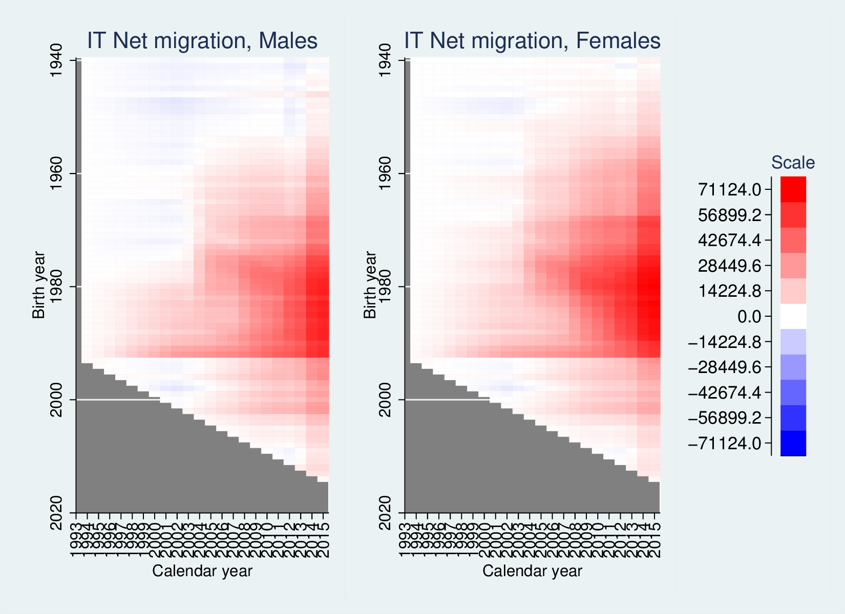
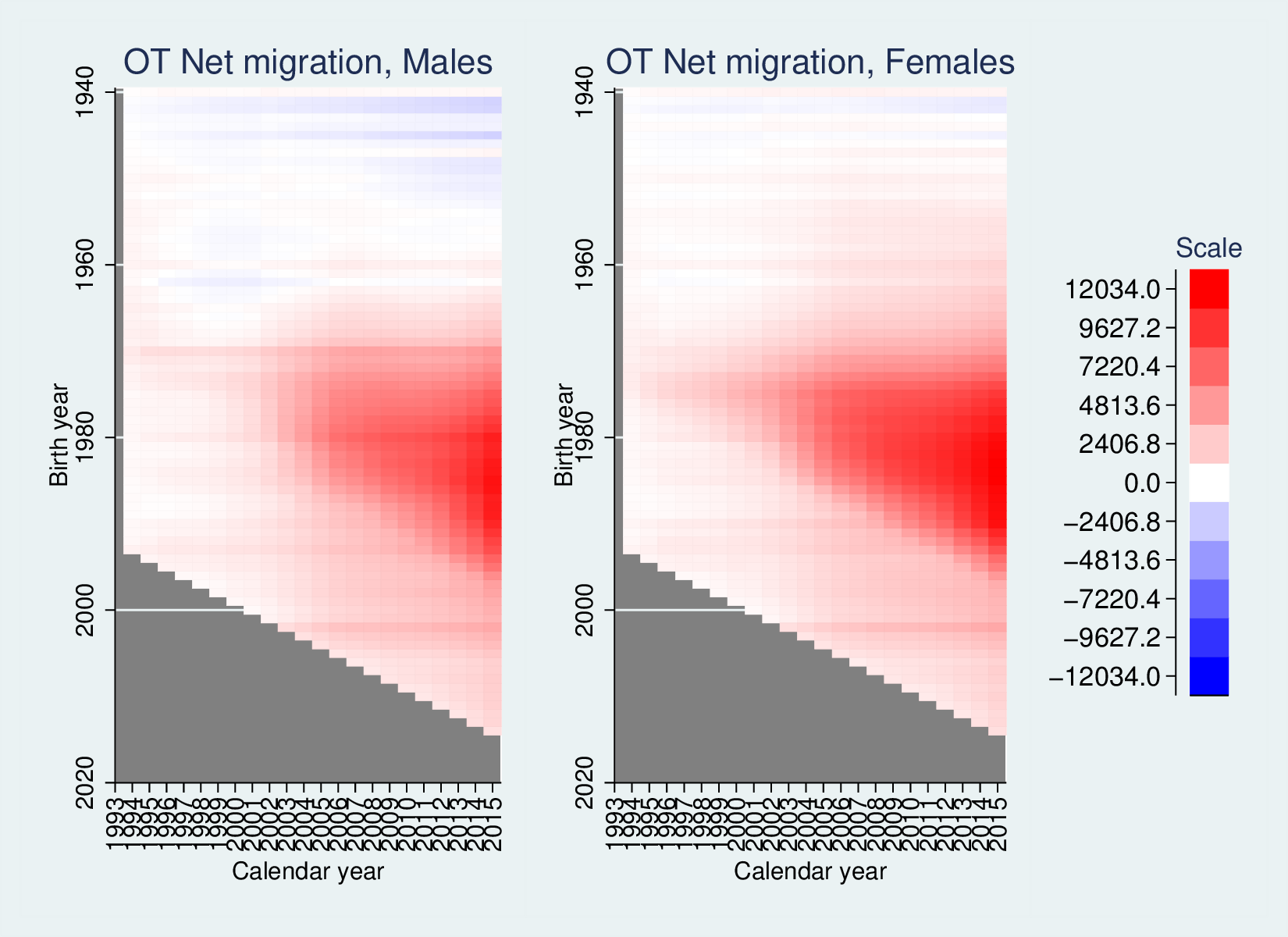
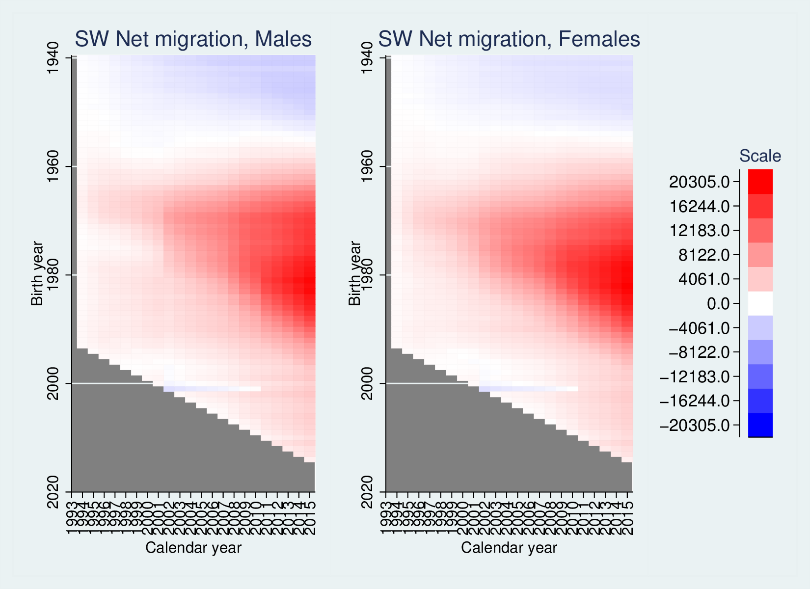
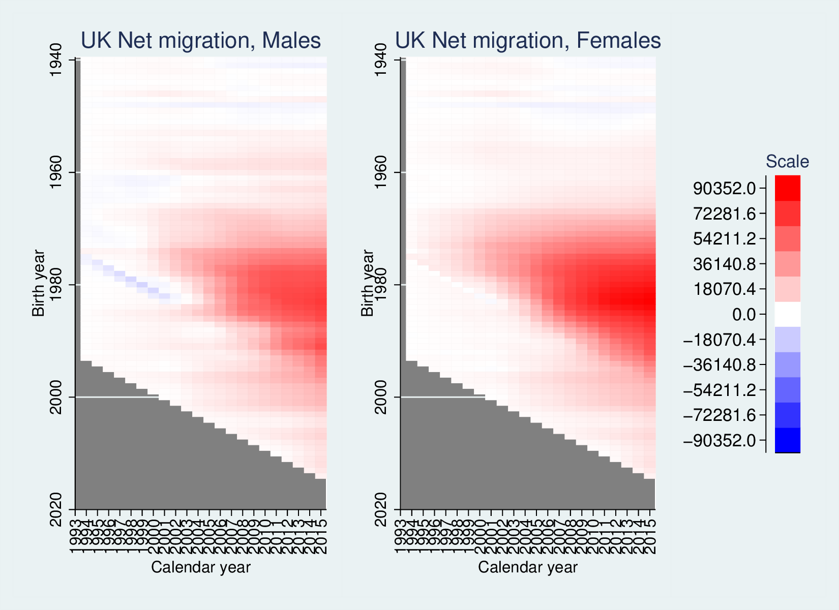
Below is a data dump for the countries in the second graphic above, Germany (with surprisingly inconsistent data), Denmark, France, Ireland, Italy, the Netherlands, Austria, Poland, Sweden, Switzerland and the UK.
It’s worth noting that the UK, like Sweden, Austria, Denmark, Germany
and Ireland have lots of net migration in the 20-40 age range, which is
economically most beneficial. France is odd: net in-migration across the
age range, but a strong pattern of significant emigration of young men
(also, but weaker, of young women). Switzerland and the Netherlands show
an interesting secondary effect, of net emigration of older cohorts (see
commentary for NL).