You may have noticed a lack of activity on this blog. I moved to https://brendanhalpin.net/blog some time ago. Please check that location out instead!
All posts by brendan
The role of indelcost: OM, LCS and Hamming
I will be blogging at https://brendanhalpin.net/blog/ from now on. Link to new post: https://brendanhalpin.net/blog/posts/omindel/
Parameterising TWED
I will be blogging at https://brendanhalpin.net/blog/ from now on. Link to new post: https://brendanhalpin.net/blog/posts/parameterisingtwed
The shortest day and the earliest sunset
Everyone knows that Midwinter’s Day, the day of the Winter Solstice, is the shortest day of the year. I think about this a lot, mostly every December/March/June/September (also around DST time changes). A few years ago I discovered the R “suncalc” package. It’s full of interesting astronomical functions, and can show the timing of sunrise, sunset, solar noon and a whole lot of other things, for any date and location. So I’ve been playing with it to help me understand what’s going on.
library(suncalc)
library(ggplot2)
data = getSunlightTimes(date = as.Date(seq(0,32), origin="2023-12-08"), lat=52.7, lon=-8.6)
data$daylength = data$sunset - data$sunrise
ggplot() + geom_point(data=data, aes(x=as.Date(sunrise), y=daylength))
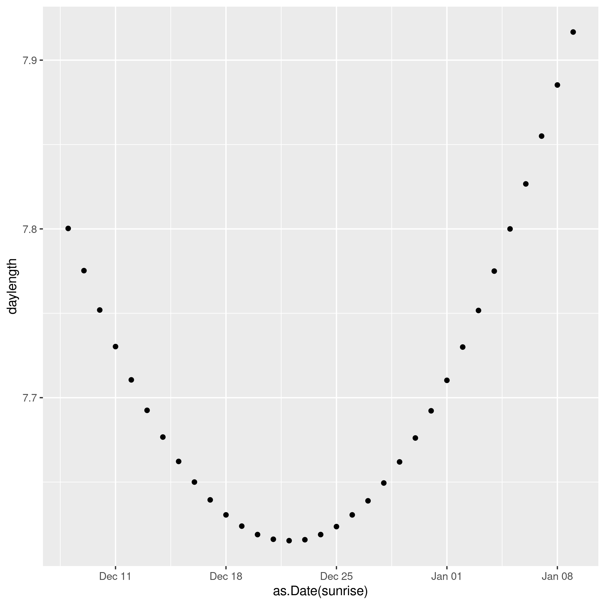
We see clearly that the shortest day in 2023 was Dec 22 (the exact solstice moment was 22 Dec, 03:27).
But the earliest sunset doesn’t actually happen then. It actually happened a few days earlier, Dec 15.
Continue reading The shortest day and the earliest sunsetIrish Universities’ Catchments: new data
Prompted by the arrival of another year’s “Feeder School” data in the Irish Times recently, I decided to update an analysis I have done in the past (Cullinan and Halpin, 2017), looking at the catchments of the several univerisities in Ireland. The picture I had from the previous analysis was that Galway, UL and UCD were most national in their recruitment patterns, TCD rather less so and UCC very markedly local.
Continue reading Irish Universities’ Catchments: new dataNetwork Sampling Blueskytes
I’m curious about Bluesky, and have accidentally found I can access part of its API. In particular, given a user’s handle, I can download their skytes, their posts. I got tipped off here: https://mastodon.social/@badlogic@mastodon.gamedev.place/111246801418649849
Continue reading Network Sampling BlueskytesSDMKSUBS: A new SADI command for substitution costs
Table of Contents
A new command
In this blog I introduce a new utility command, sdmksubs, which creates substitution cost matrices for sequence analysis, as part of the SADI Stata add-ons.
Most sequence-analysis distance commands require the specification of substitution costs, which describe the pattern of differences in the state space through which the sequences move. These can be derived from theory, from external data, or can be imposed by researcher fiat. It is also common to use the pattern of transitions in the sequence data to derive them, though this is not an unproblematically good idea. The existing trans2subs command in SADI calculates simple transition-based substitution costs. The new sdmksubs calculates this substitution cost structure, and a range of others, some simple “theoretical” ones, and some based on the transition pattern, but taking more of the data into account than the traditional trans2subs matrix.
SADI is a Stata package sequence analysis of data such as lifecourse histories, and has been around for quite a while. Recent improvements includes fixes for internal changes in Stata 18, lifting limits on sequence length, etc., but here I focus on sdmksubs only.
Writing a Stata Command
In an idle moment this afternoon, I wrote a Stata command.
It was to create a light-weight implemention of the “percentogram” described at https://statmodeling.stat.columbia.edu/2023/04/13/the-percentogram-a-histogram-binned-by-percentages-of-the-cumulative-distribution-rather-than-using-fixed-bin-widths/, and I like the result, but it struck me that it is a good example of how practical and useful it can be to engage in Stata programming. Also, it’s a good example of how writing code in Stata (in a programmable command language) is very different from writing code in a stats-capable programming language like R, Python or Julia.
Continue reading Writing a Stata CommandTwitter activity after the ElMuskalypse
Premise
Did Twitter lose activity since the ElMuskalypse? Is my timeline quieter than it used to be when I was reading it? I mothballed my account around the end of November, after Elon Musk took over. How much activity have I been missing? To what extent have the people I followed also stepped back from Twitter?
How would you measure activity of your Twitter (ex-)timeline? Using the Twitter API, how would you assess whether the people you follow are more or less active? The simplest idea is to download the tweeting history of everyone you followed, and tot up their tweets by day. In principle that’s easy to do, if you have access to the Twitter API (and it still works). But it turns out it’s a bit more complicated than that, if you want to use this data to characterise how your timeline would have behaved in the interim.
Continue reading Twitter activity after the ElMuskalypsePremise
Did Twitter lose activity since the ElMuskalypse? Is my timeline quieter than it used to be when I was reading it? I mothballed my account around the end of November, after Elon Musk took over. How much activity have I been missing? To what extent have the people I followed also stepped back from Twitter?
How would you measure activity of your Twitter (ex-)timeline? Using the Twitter API, how would you assess whether the people you follow are more or less active? The simplest idea is to download the tweeting history of everyone you followed, and tot up their tweets by day. In principle that’s easy to do, if you have access to the Twitter API (and it still works). But it turns out it’s a bit more complicated than that, if you want to use this data to characterise how your timeline would have behaved in the interim.
Continue reading Twitter activity after the ElMuskalypsePinging Mastodon instances
Mastodon is less discoverable than Twitter, particularly because it doesn’t have full-text search, and because it has multiple instances. How do we know what’s going on, or which instances are particularly active?
There is a webpage of instance data somewhere. That is a good starting point.
But what about propagation of individual posts? How do they get seen, how quickly do other instances pick them up, which other instances? Here I summarise a quick experiment that exploits a feaure of mastodon software’s behaviour to map out some details of how a post is seen by other instances. Continue reading Pinging Mastodon instances