In my recent blog on three-way referendums, I found myself wanting to represent how a three-way outcome varied across two dimensions. It was easy enough to represent the prevalence of one of the outcomes versus the rest, on a scale of 0-100%, by sampling the two dimensions at discrete intervals, i.e., calculate the Z variable across an X-Y grid. This yields a one-dimensional heatmap, where colour codes the percentage of the outcome (black at 0% to white at 100%).

I wanted to represent three outcomes, so this was only partly satisfactory. But since the three outcomes add to 100% (and thus have only two degrees of freedom) I can use a ternary or triangular colour scheme: a different colour for every value of X, for every value of Y (where Y varies from 0 to 100%-X, and Z is implicit as 100% – X – Y).
This is easy to do with RGB colours, which are represented as three dimensions on a 0-255 scale. Taking my outcomes, I re-scale them so that they vary between 0 and 255, and I can use the three numbers as RGB values. Luckily I had a little Stata program already written which makes a heatmap, taking three RGB values for each cell. See bhhmaprgb.ado (undocumented for the moment, I’m afraid).
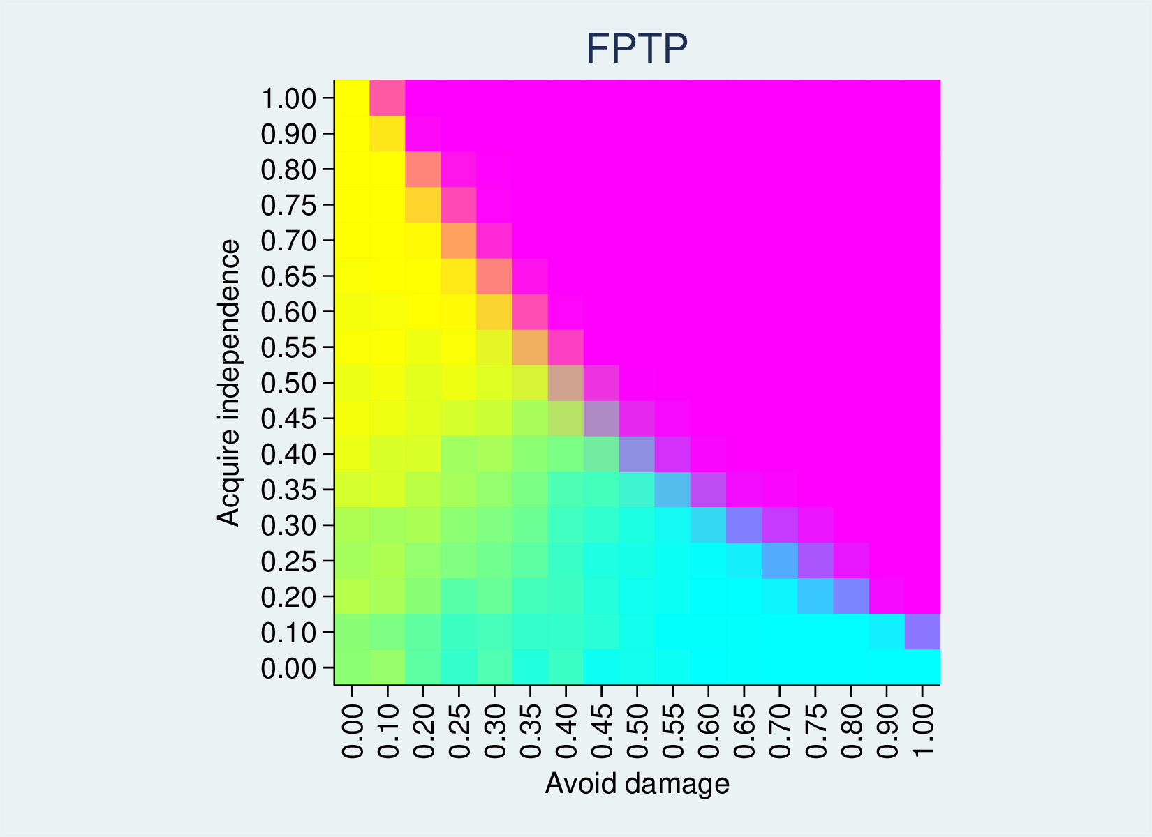
I collapse the data so I have one observation for each row and column (ds1 is the column variable, representing how much a Brexit deal avoids economic damage, and is1 is the row variable, indicating how much the deal achieves independence). Each observation has the proportion of simulation runs where each of three options wins, rescaled to 0 to 255.
bhhmaprgb ds1 is1 fptp1 fptp2 fptp3, xtitle(Avoid damage)  ///
  ytitle(Acquire independence) aspect(1) ///
  title("Red Green Blue ternary palette")
This yields the following heatmap, where 100% option 1 gives a bright red, 100% option 2 a bright green and 100% option 3 a bright blue. 50% option one and 50% option 2 will give RGB(127, 127, 0), a muddy colour. 50% option 1 and 50% option 3 will give a wine colour, and so on. An even three-way split will give a grey.
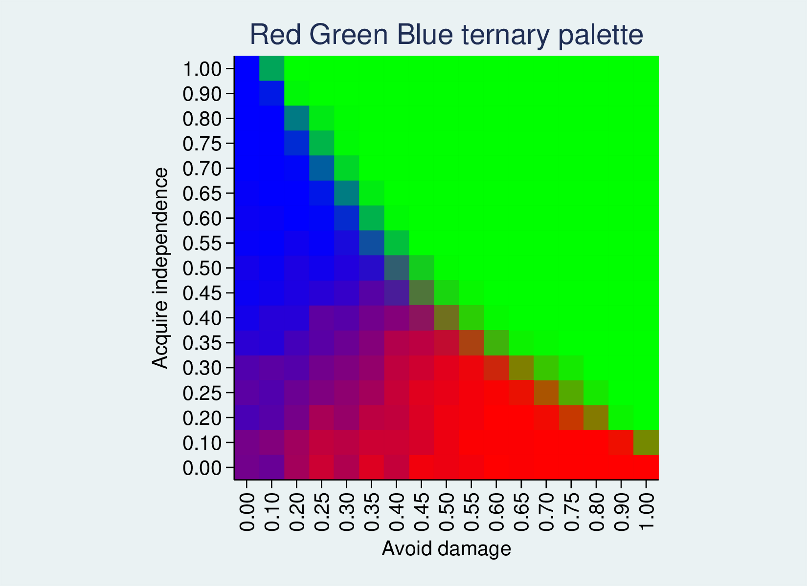
The first-past-the-post outcome is a good example, because it has zones where each of the three options is 100%. Where the compromise deal is very good (top-right) we have green. Where the deal is less good, but is more attractive for leavers than remainers (top-left), it splits the vote and Remain (option 3) wins, so we have an area of blue. In the lower right, the deal is attractive for remainers, so red Leave wins. On the borders between these zones we have intermediate colours.
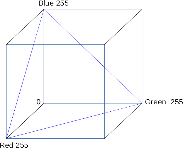
Because we have three options, we appear to be working a 3D space. But since there is a constraint (they sum to 100%, or 255) we are in fact working with a 2D plane. The RGB colour space can be considered as a cube, with three 0-255 dimensions for red, green and blue. The colours we use here are a plane that cuts through the cube, that hits all locations where R+G+B = 255. (The blue triangle shows the edges of this plane.)
We could imagine the cube containing planes parallel to this one, where the sum of R, G and B is a smaller number, but, naturally, those will have less range in their colours and be more subdued. This plane is the brightest one of that set. However, this is not the only plane of that size we could cut through the cube. By reversing the three dimensions, we could get a Cyan/Magenta/Yellow plane. See the red triangle:
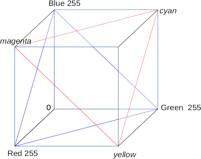
If we reverse the three variables (e.g., gen r2 = 255 - r) we use this plane, with the following results:
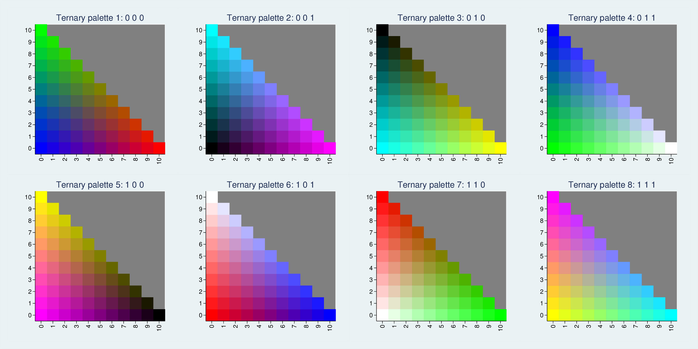
In fact, there are eight ways to cut through the cube to generate maximally distinct colour planes:
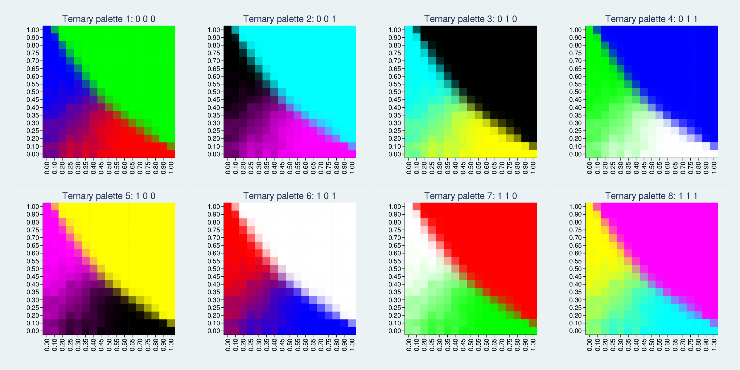
The RGB colour cube has 8 vertices, representing white, red, green, blue, cyan, magenta, yellow and black. Each of these triangles picks three vertices which differ completely on one of the RGB dimensions. We could pick other trios, such as red, blue and black, but they would differ less (in that example, they are all zero on the green dimension) and therefore be less distinct and colourful.
It does make one think about how common red, white and blue flags are, though.
If the colours are too garish, we can use planes closer to the (0,0,0) origin. This FPTP example has large zones of 100% values, so it is very bright. If the extremes are less common, the full range will look less garish. For instance, here are triangles where only the three vertices are at the extreme.