Viral Variants

Scary mutant COVID-19

Since the news of a potentially more transmissible strain of C19 broke in the UK, I’ve been thinking about the mechanics.

I was initially sceptical because it seemed to help politicians evade blame. Given the earlier fuss about a strain spread by holidaymakers returning from Spain in the summer, how much of the emergence of a new strain was down to network effects (common because it was, for example, present in a number of super-spreader events) versus inherent infectiousness?

So I simulated, with a workbench of 160000 agents in a 2D grid network, 1600 seed infections, and daily contact between 23 of the nearest 24 neighbours, and one random remote case. Base infectiousness, death and recovery rates are set to yield an R0 of about 3 and a SIR plot as in Figure 1.

strainblogSIR.png

Figure 1: SIR plots

Continue reading Viral Variants

Genetics and Sociology

I was googling terms related to social science and genetics, and I happened on TCD’s research website, where they have a theme for “Genetics and Society“, selling their research in the area. Mostly anodyne boosterism but I tripped up at what they had to say about sociology:

In Trinity, multi-disciplinary teams work together to address key questions;

[…]

In Sociology: how will individuals and society benefit from this information?

Such weak sauce. They obviously didn’t talk to any knowledgeable sociologists.

It triggered a rant (though to be fair, about points I’d been thinking about already, relative to the relationship between the social sciences and the new biology, so this isn’t all really at TCD’s expense). Continue reading Genetics and Sociology

Correlations, smoothed time-series and sewage sludge

A very nice idea: search for evidence of COVID-19 RNA in municipal wastewater, as a cheap and fast form of public health surveillance. A pre-print shows that this works well, in a trial in Connecticut. I think the evidence is in their favour, but they commit two cardinal errors: first, they report a correlation (well, a squared correlation) between time-series and second, they do it on smoothed data. Autocorrelation means time-series may have vastly inflated and/or spurious correlations, and stripping the noise out of variables removes the noise from the comparison, making it seem, well, much less noisy than it is.

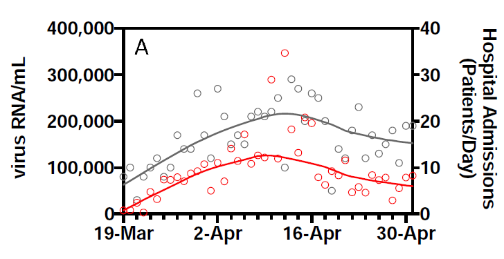
This is one of their key results: the smoothed RNA curve looks just like the smoothed hospital admissions curve, with a lead of about 3 days:

sewage.png

They report an R2 of 0.99 for this relationship.

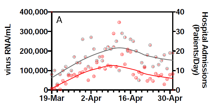
However, they also show the data. Given there are 2 series for 44 days, we can pick this off the graph without too much effort:

sewagecheck.png

(This is prompted by @lycraolaoghaire’s tweets: https://twitter.com/lycraolaoghaire/status/1265251252239286272?s=20).

It turns out that the correlation between the RNA measurement and hospital admissions is 0.357 (R2 = 0.13). If we lag by one day, the R2 rises to a very respectable 0.45, but declines again if we lag by 2 (0.22) or 3 (0.22) days. In other words, there is a real signal here, but it is vastly overstated by R2 = 0.99, and the lead it gives is not as big as claimed.

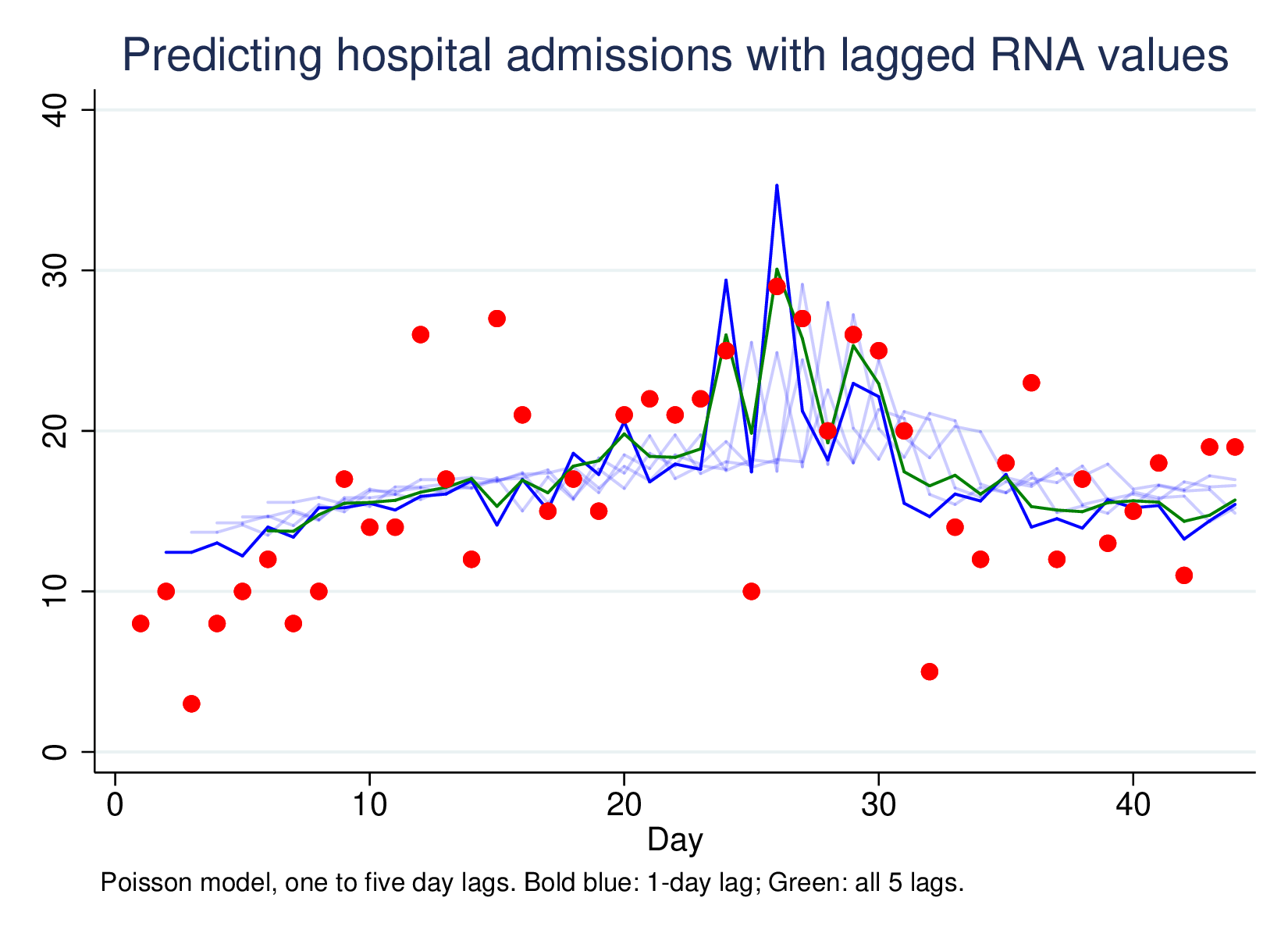
Predicting hospital admissions using lagged RNA values, with lags of 1 to 5, and then all five lags together (green line) looks like this:

lagpred.png

This is a much less impressive graph than the original, but it is picking up something. Most of the work is done by the one-day lag, which has a clear effect, and the combined 5-lag model isn’t better (by LR-test) than the L1 model only. However, using this technique very widely as a passive surveillance technique is going to pick up unexpected large shifts in disease RNA, which is much more important than being able to predict moderate changes in hospitalisation from moderate changes in RNA presence in sewage sludge.

Screen-picked data available here, no warranties.

COVID-19 deaths: NI and IRL compared

Mike Tomlinson has created a certain amount of controversy by asserting that Northern Ireland’s COVID-19 death rate is disproportionate with that of the Republic (see article). In particular, he notes that the per capita rate of deaths in hospital settings (which is all that is reported for NI) is higher than that for the Republic (which normally reports all deaths, but for which the hospital deaths figure is also available). For instance, yesterday’s data says the cumulative figure for hospital deaths in the RoI is 386, while for NI it was 250.

Scaling by the relative populations, that suggests an expected NI hospital death rate of 386 * 1.891 / 4.904 = 148.8. 250 is a lot more than 149, even allowing for some incomparability in how the stats are collected.
Continue reading COVID-19 deaths: NI and IRL compared

Shiny apps for distributions

For years I have taught students to read printed statistical tables: the Standard Normal Distribution, the t-Distribution, the chi-square Distribution. I want them to do certain tasks (e.g., construct a confidence interval) “by hand” a few times, rather than in Stata, so that they understand what it is doing. I also want them to be able to do it with no more than a calculator, in the final exam.

For the past few years I’ve been working with R-Shiny to develop web-apps, which allow exploration of a concept, self-learning exercises and self-marking assessments. I also use it increasingly in class to demonstrate ideas. I’ve been tempted to replace the paper distribution tables with online versions, but have been holding back because of the pen and paper exam.

Continue reading Shiny apps for distributions

Bicycle schemes need big cities

In larger cities such as Lyon or even Dublin, bikeshare schemes are quite successful. In smaller ones like Limerick they struggle. I am convinced the problem is critical mass. As a scheme gets bigger, it provides disproportionately more possible useful journeys (as long as there is the population density to support it).

I want to model this. Let’s start by imagining cities that are big enough to sustain a square grid of bike stations, and let’s count the number of possible A-B journeys it provides (of different distances).
Continue reading Bicycle schemes need big cities

Single Transferable Voting: efficient?

How well does multi-seat constituency STV select candidates?

Multi-seat STV as a voting system is meant to yield approximately proportional outcomes (parties proportions of seats should approximate their proportion of the vote). It has other advantages, primarily that voters don’t need to vote tactically, since their preferences will be reflected (if your favourite candidate has no hope, voting for them is not throwing away your vote). But compared with other ways of electing people in multi-seat consitituencies, how well does it perform?

Continue reading Single Transferable Voting: efficient?

Using R-Shiny to Teach Quantitative Research Methods

What and why

Over the past couple of years I have been developing a small suite of R-Shiny tools for teaching quantitative research methods. R-Shiny is an R library for writing interactive web pages with full access to the power of the R statistical programming language. The tools I have written include demonstrations of ideas, self-teaching exercises and assessments.

If you use R already, writing Shiny web pages is a relatively easy extension, though programming an interactive web page has some important differences from conducting a data analysis. R is very general and very powerful, so there are lots of possibilities. This is both a strength and a weakness: generality means that while lots of things are possible, many require extensive programming. Nonetheless, it is relatively quick and easy to create simple and robust tools.

This (relatively long) blog is based on an early draft of a paper summarising some of the main things I have learnt, and showcasing a handful of examples. I’m putting it out partly just to record and display what I’ve done, but also to solicit feedback, particularly about how best to use apps like this to good pedagogical effect.

Continue reading Using R-Shiny to Teach Quantitative Research Methods

Seminar: R-Shiny for teaching

Department of Sociology Seminar

Weds 27 November, 12:00-13:00, F1030 Foundation Building

Using R-Shiny to create interactive apps for quantitative research methods teaching

Brendan Halpin, Dept of Sociology, University of Limerick

R-Shiny, a library for the R statistical programming language, makes it easy to create interactive web-pages which build on the statistical tools which R provides. In this talk I will discuss my experience using R-Shiny to create:

  • interactive demos
  • self-learning apps and
  • automatically graded assessments

for students on quantitative research methods modules

Demos are apps that demonstrate a statistical concept, allowing students to vary parameters and see what changes. Self-learning apps allow students to undertake a task repeatedly (with fresh numbers each time), and receive instant feedback. Assessments give students questions with individualised numbers but identical structure, store the answers and automatically mark the submission, with detailed feedback.

R-Shiny offers potential for anyone teaching statistics or quantitative research methods, in any substantive area. The talk will consider pedagogical and programming issues, and summarise the experience using this approach with undergraduate and Masters sociology students over the past few years.

Emacs and org-mode for sending mailshots

I use Emacs for reading and sending email, so I’ve been using emacs-lisp to send mailshots for years (but in a rather clunky way).

The big shortcoming is that it is not hugely convenient getting the data (e.g., student names, email addresses, marks, comments) into emacs-lisp data structures, or conveniently writing the emails.

org-mode makes it all easier.

I present an example here: how to send mails giving feedback on performance in a test.

Continue reading Emacs and org-mode for sending mailshots